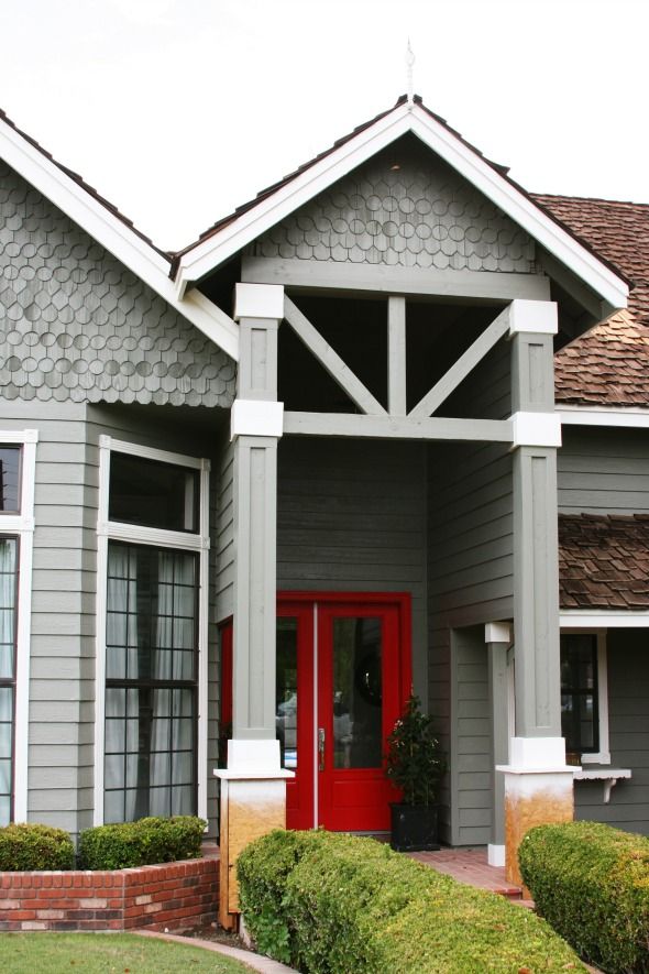
Benjamin Moore, a company I love and support whole-heartedly, saw that we were planning to paint our house and reached out about donating the paint. What an AMAZING help that was! The house needed a ton of prep work before the paint, and we made some big changes to the exterior structures with a contractor, so the labor alone ended up taking most of our exterior budget. Getting to work with Benjamin Moore on the paint was a dream come true! :) But I'll get to that in a minute. Here's the story of how the exterior of our house has changed this year, and a few plans for finishing up.
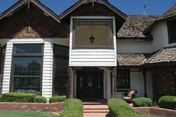
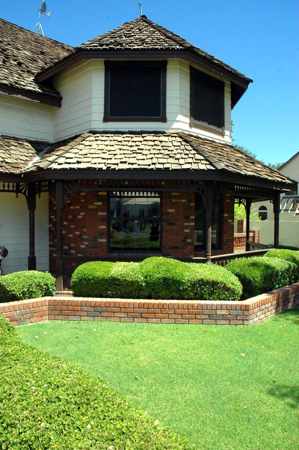
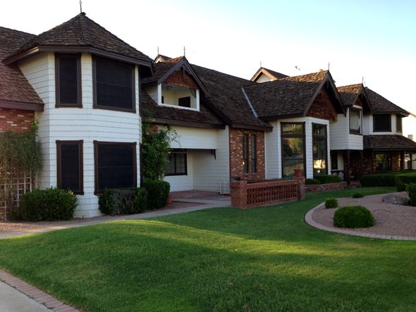
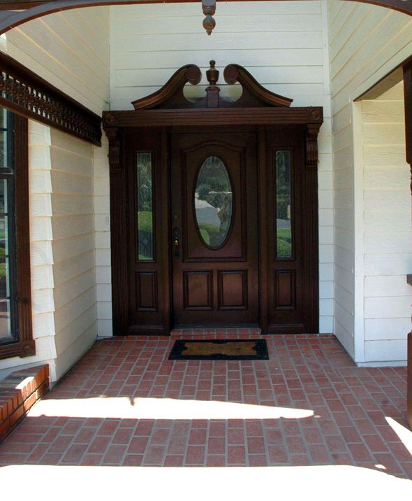
The first big project was changing out the front door. It's hard to show in pictures just how much of a transformation this was! The old door was only 80" tall, which felt so squatty with the tall vaulted entrance. Here's the post on changing out the door.
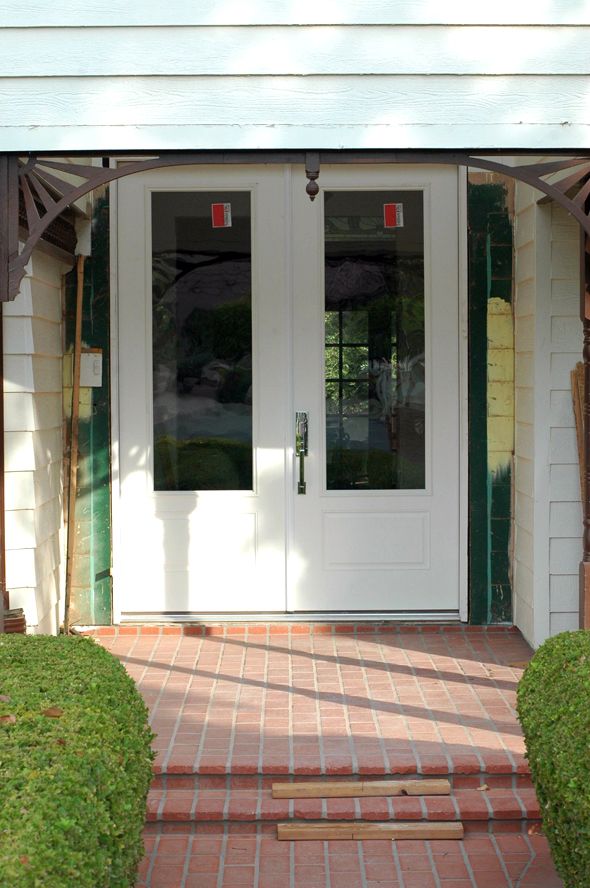
We chose a 9.5' tall double door. It fit the vertical space much better, but the door was blocked in the front by the weird front facade area.
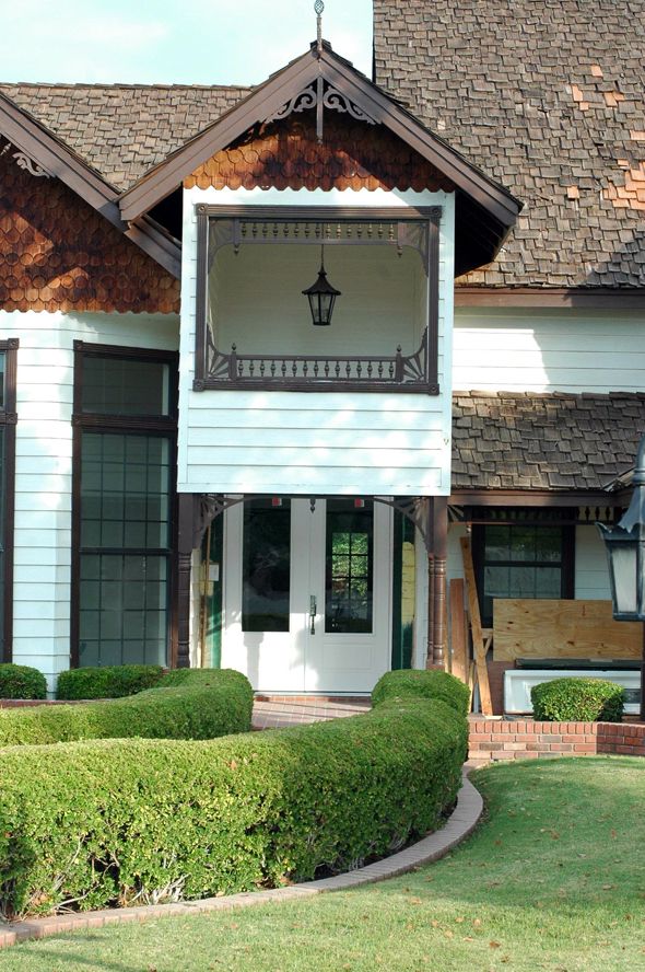
My original thoughts were to just remove the front panel and open everything up all the way to the roof basically.
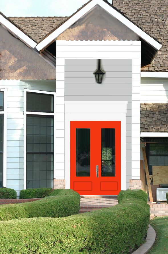
But after we opened it up, the proportions felt so weird again! Too much was exposed, although, I was loving how much light was streaming in to the entry after getting rid of that partition piece!
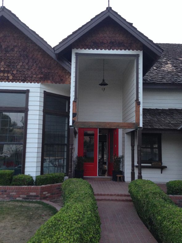
Our contractor was nervous about losing the cross beam altogether as well, even though it wasn't technically the load-bearing beam. So we came up with an idea to bump up the beam and add angled beams in too, which we would mimic all around the exterior of the house, where all the gingerbread used to be.
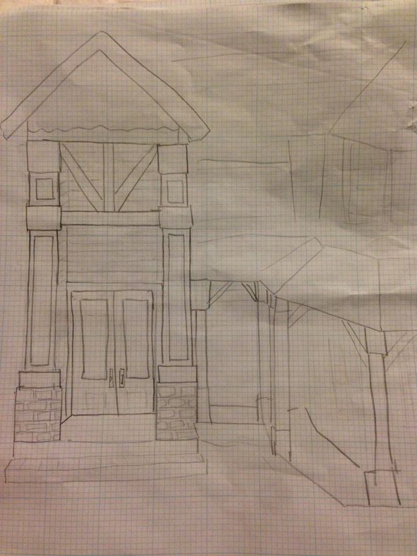
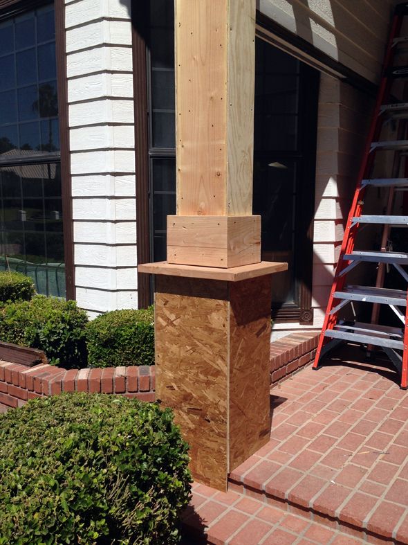
All the turned columns were replaced with chunky square beams and instantly everything felt more modern and more balanced.
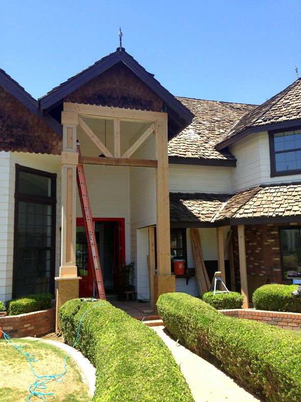
Once the exterior structural changes were almost done I went to my local Benjamin Moore store (Color Wheel on Stapley and Main) and looked at swatches for a good long while. I talked to them about different paint lines too and got their advice on that and finishes.
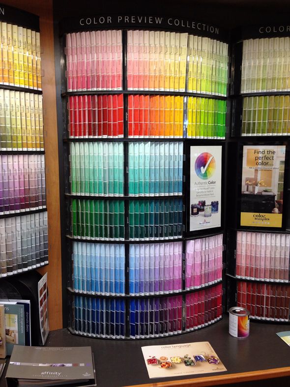
Benjamin Moore has so many wonderful colors it was tricky to pick a favorite for the house. I was drawn to the greeny grays the most and picked up a couple of chips and even a few sample pots to put up.
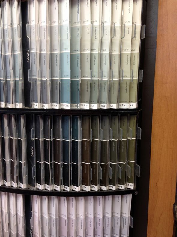
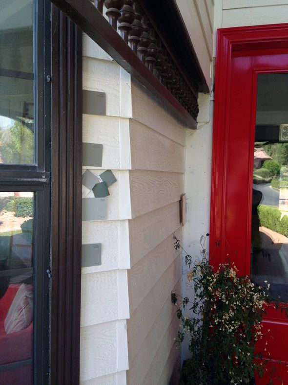
I put this photo up on Instagram for a reader vote. It seemed pretty split, which I expected. They're all great colors! (Top to bottom: Fieldstone, Desert Twilight, Rockport Gray)
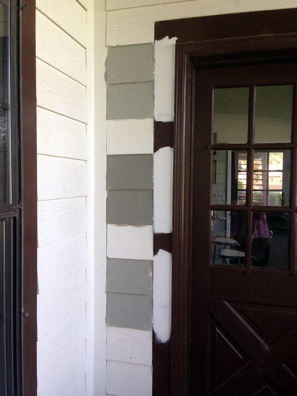
I really tried hard to make it not be the name the put me over the edge, but Desert Twilight (2137-40) was my favorite from the get-go. It was a little more green than I originally thought I'd want, but more and more I was in love with the shade and the idea of a greeny gray house. (Or at least I didn't want a color with very blue undertones and I felt like my other top choices swung more blue). I put up a big sample on the front and the back of the house, so we could see what Desert Twilight did at different times of day.
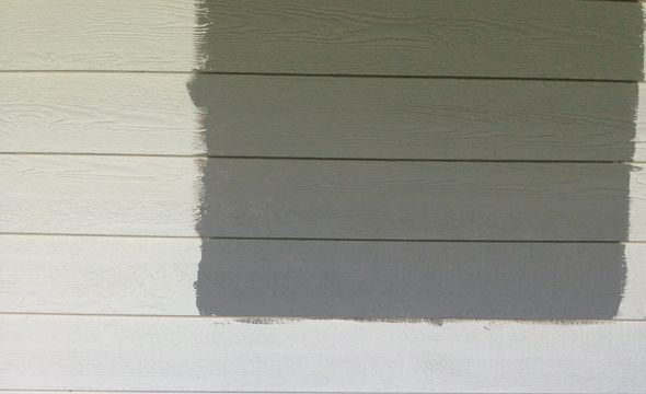
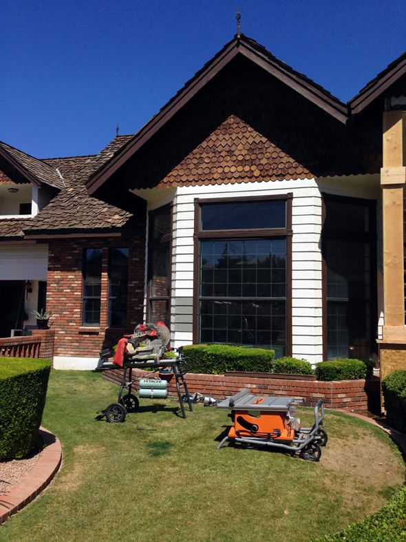
I was a little apprehensive to make the final call, but I knew I'd love the color, especially once all that icky brown color was gone.
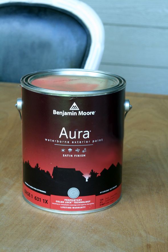
It was an exciting day when the painters sprayed the first coat of Aura on the back of the house! So pretty! So dramatic!
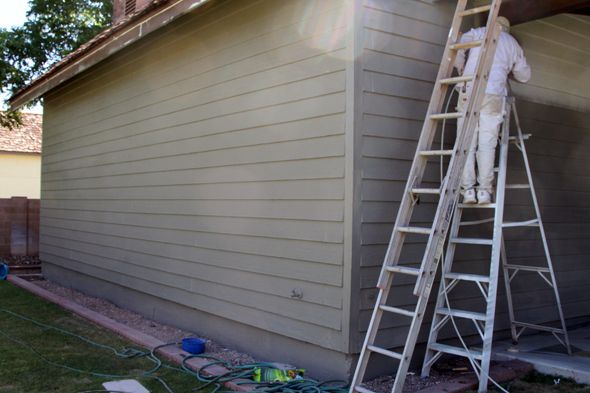
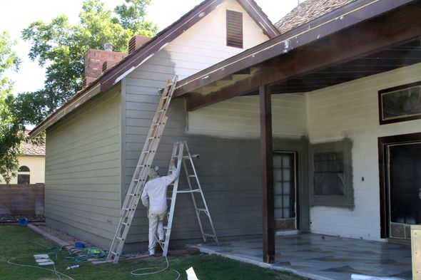
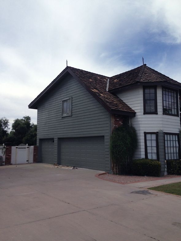
The Aura paint is actually self-priming, so we didn't need to use a primer on the back at all, but the front of the house gets a lot of full sun and there had been some damage from the elements. And since I wanted to paint out the weird shake shingles on the front of the house, the painters decided it would be a good idea to spray a coat of primer on the front. I knew the shake would never be a consistent, solid color the way that the siding looks, but I think the layer of primer helped even out the shake shingles.
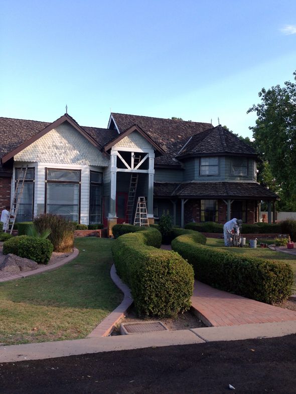
I think painting the shake out helped unify the choppy look of the house so much! I almost painted out the brick for the same reason, but I think I'm glad we kept the brick as-is for now. It was tricky to find a stopping point with the brick and I didn't want to paint the floors or the fencing.
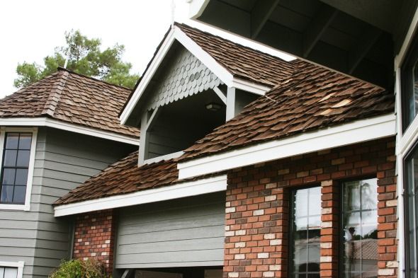
We might figure out something to do with the brick down the road, but for now I think the new house color is in harmony with the tones of the brick. Such an improvement!
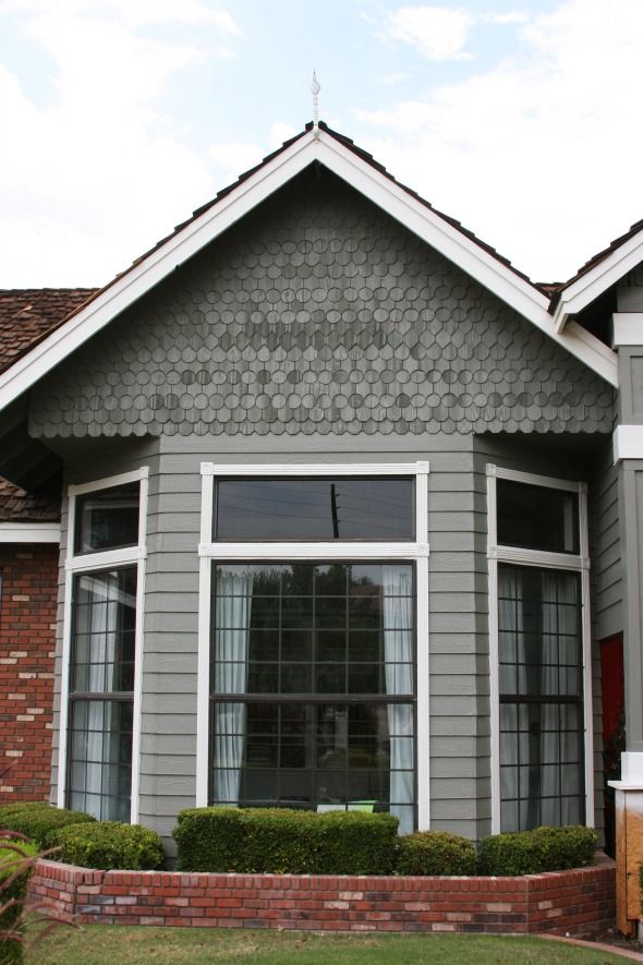
As soon as the white trim went on, I finally felt like I could catch my breath and let go of my worries about this project! It looked SO much more fresh with the dark trim gone!
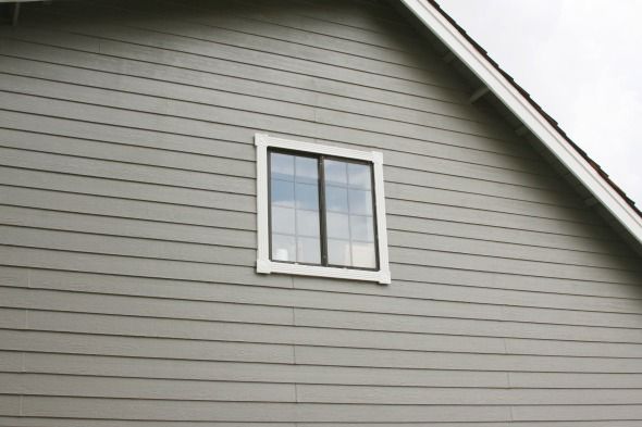
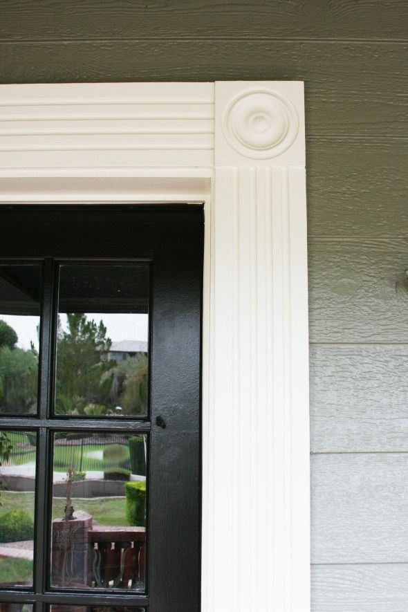
We chose White Dove (OC-17) for the trim and Onyx (2133-10) for the doors. All Aura, all satin.
We decided to keep the front door red in the end. I love how it looks against the Desert Twilight color! I was worried it would look Christmas-y, but it really doesn't. I actually think the red tones down the green a bit too.
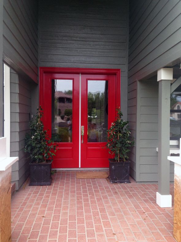
So, I'm sure you noticed, but we still have a way to go with the exterior of the house before we can call it good. We're saving our pennies right now so we can replace the roof next spring. It's expensive and not fun to spend that kind of money, but we've known about it and it is what it is. In the shorter term, we're going to have a mason come out and fix some of our broken bricks and then add matching brick to the bases of the two new columns flanking the front door.
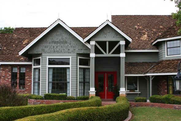
Looking down the road maybe a year or two, I'd like to change up the landscaping. Not sure with what, but something less twisty and curvy and fussy would be my preference. But truly, I am SO happy with all the changes we've accomplished in only a year's time! Every single one of our neighbors has stopped by to say how much they love it too and the validation feels great! :)

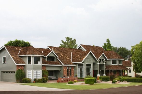
And OF COURSE, thank you, thank you, thank you to the wonderful people at Benjamin Moore, both local and corporate, for helping us to transform our home! We could not be more happy with the product or the outcome. :)

0 comments:
Post a Comment