I was lucky enough to get to work with Farrow & Ball on behalf of Domino a couple months ago. They had heard that I was picking a F&B color for my music room (I've already mentioned before that Michael and I had decided against the bright cobalt blue), and they offered to send a color expert over to the house for a color consultation.
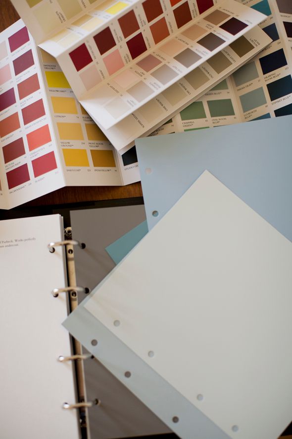
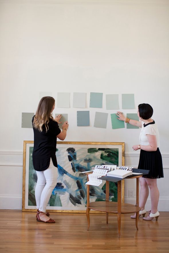

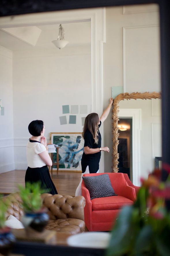
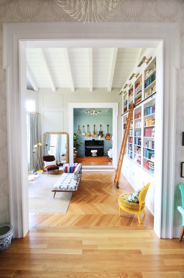
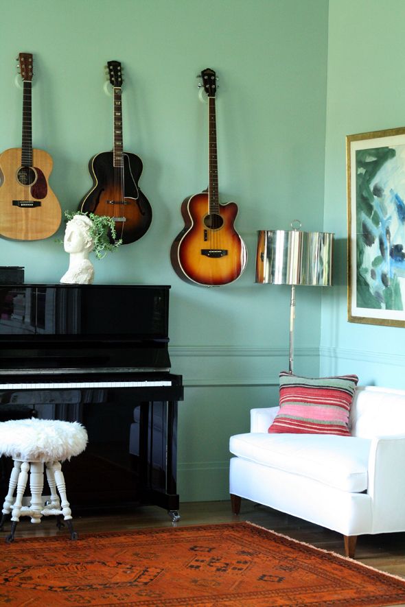
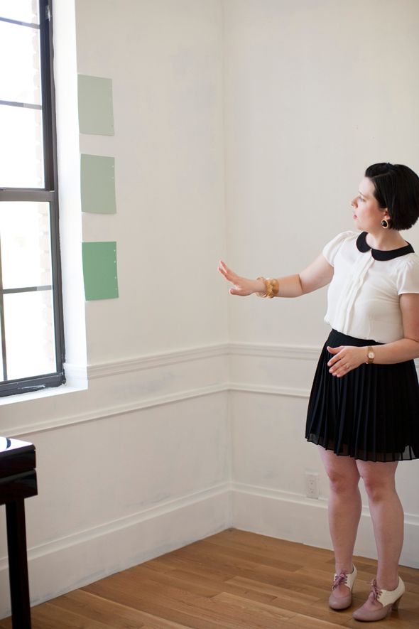
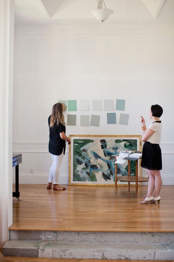
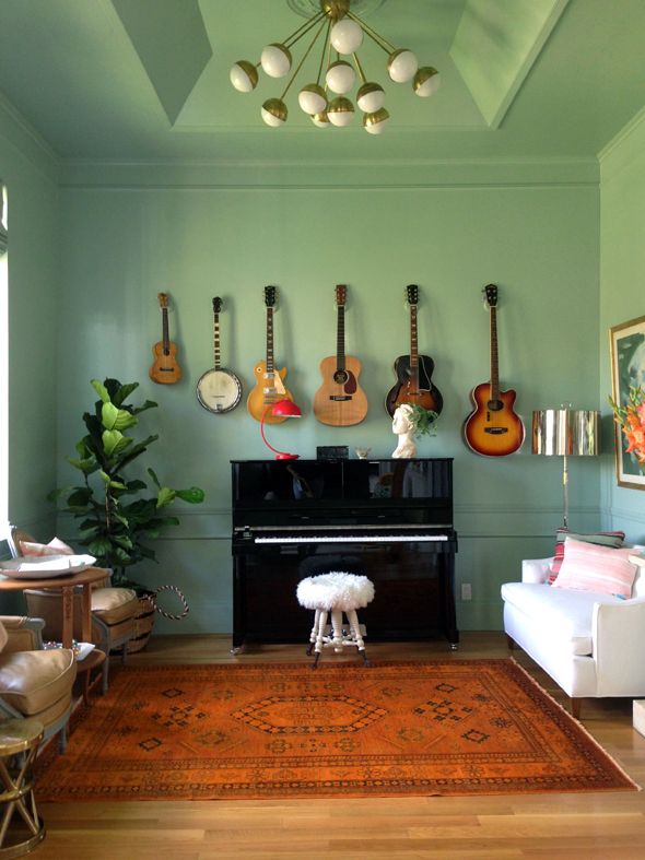
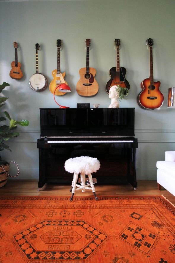
It was SO FUN to meet Amber, who works out of Farrow & Ball's Chicago showroom. Not only was she an all around delightful person, she had the most amazing eye for color and so many insightful thoughts to share. We showed her our home and talked about our decor plans and our color preferences. I had been leaning toward a great color called Green Blue, and after lots of discussion about lighting and room functionality, Amber and I both agreed the color was the right choice for the music room.
Amber and I loved that the color was sort of a darker version of the green I had ordered for the library curtains.
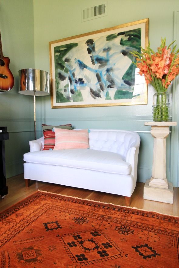
Amber was really drawn to the watercolor abstract I had been planning to hang in the music room and we both thought that the warm, bluey green would compliment the painting really well.
She and I gushed about how pretty the green color pairs with oranges and wood tones. Since I had already purchased the orange over-dyed rug, and I knew I would want to hang Michael's guitars on the wall (more info on these purchases/projects in posts to come!), I couldn't wait to get this color on the walls!
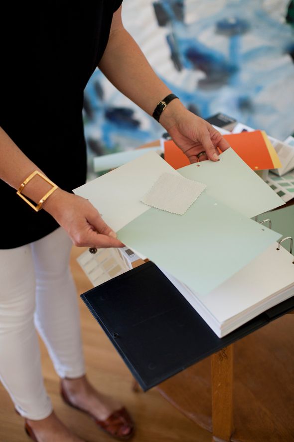
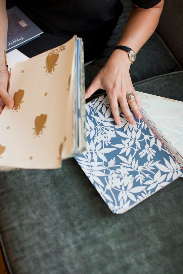
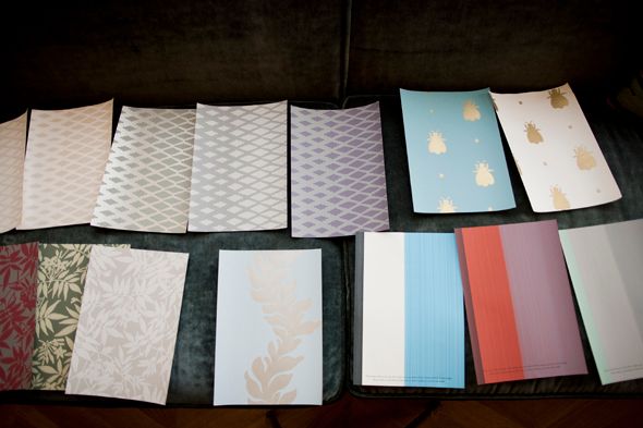
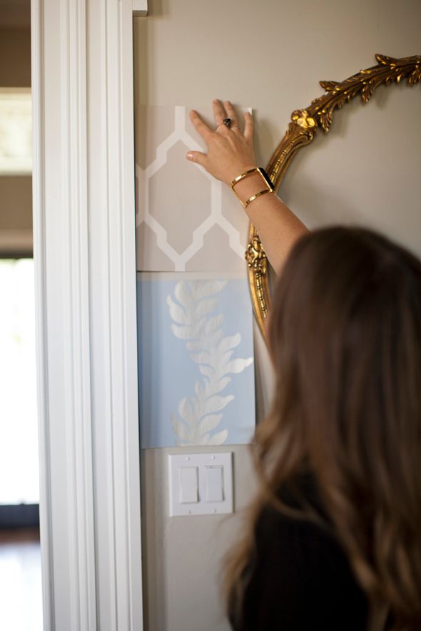
My favorite part of my meeting with Amber was when we were wrapping up the consultation and she threw out a suggestion to wallpaper the entry. I had been so focused on other spaces that I hadn't even really been looking at the entry. She and I agreed that the space was begging for a pretty pattern, so we spent some additional time browsing her samples. Heaven, I tell you!

I am such a huge fan of Farrow & Ball colors and paints - it was a pleasure to get to learn more about the company and their beautiful products during this color consultation. I truly couldn't be more happy with how the music room turned out. The color is just what I envisioned - cheerful and soothing all at once. :)
A big thanks to the Domino team for letting me be the Farrow & Ball color consultation guinea pig! It was an amazingly helpful service - I'd recommend it for even the most over-confident of decorators. ;)
And thank you to Stacie Lang for the photos of my visit with Amber!
0 comments:
Post a Comment