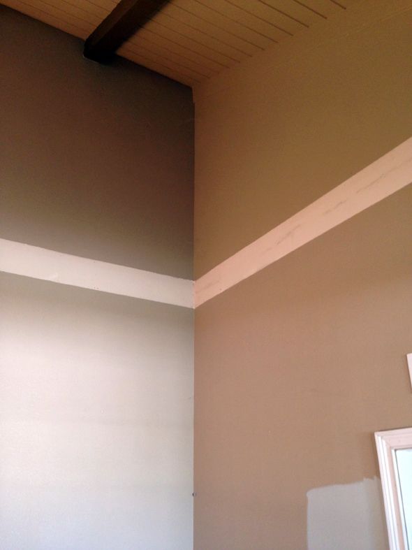
I hardly ever hire out painters for my own spaces because I don't mind just doing it myself, but the job for these three rooms was definitely in the DDIY category, and I called in the big guns.
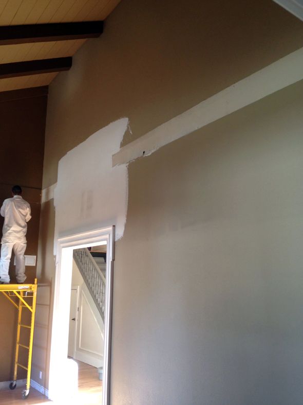
The company I ended up using had had a cancellation and they were available to start work within a few days, which was great, but also meant I had to nail down paint colors very quickly. I stress about 100 million times more with paint colors when I'm hiring the job out. When I'm painting myself, if I make a color mistake, all I'm out is $50 in paint and a few hours time. Big paint jobs like this are (very) expensive though and the pressure is majorly on.
You might remember from this post how I was leaning toward Benjamin Moore's Titanium. I'm glad I had a few weeks to sit on the decision though. I ended up feeling like the blue undertones in Titanium weren't actually doing me any favors for making the floors look less pink.
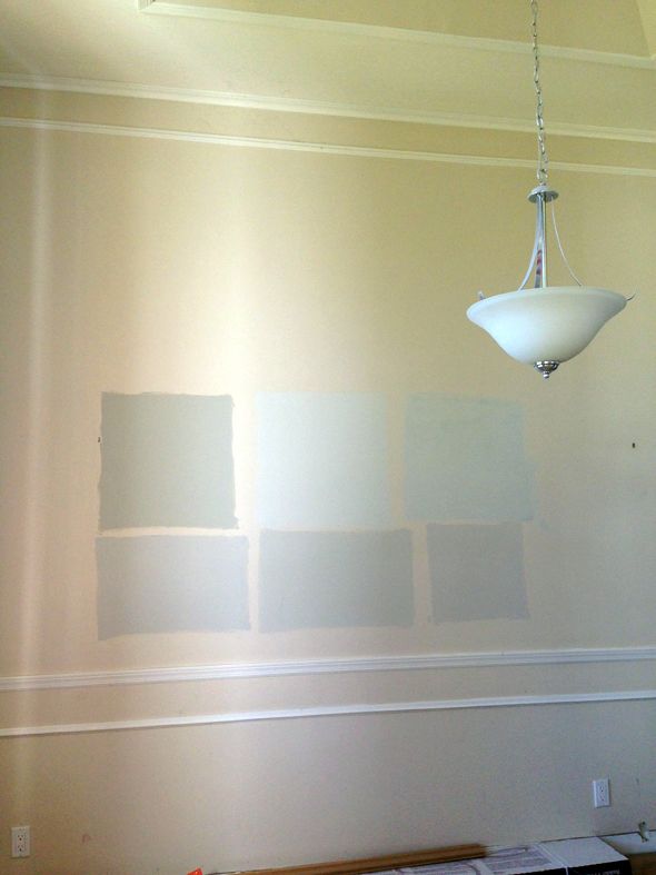
So I went to the paint store in search of a new gray. I picked up a few samples and threw them up on the wall. I put Titanium up there too for comparison.
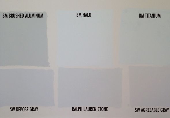
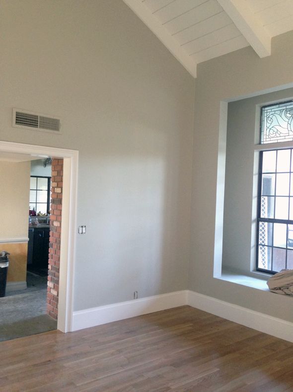
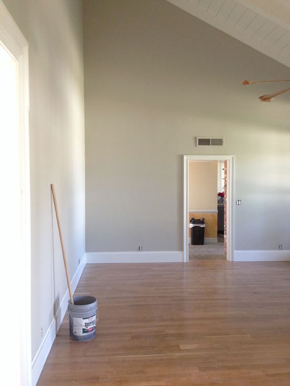
I thought Ralph Lauren's Stone was really, really pretty, and I almost went with that. But then I started looking at Brushed Aluminum a little more. I liked that it was a neutral, but with a depth of color in the undertones. Equal parts blue and green. I threw up a bigger sample in the library and loved it more. So I put up samples on most of the big walls, just to see how the color changed with the light. It was so interesting to me how it was more of a color in the front of the house and was way more true gray in the back of the house.
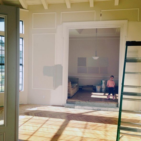
Here it is next to the Titanium sample I had up for forever. The soft blue gray color is so pretty, but it sort of fell flat for me after a while. The rich, warm greeny grays of the Brushed Aluminum felt like exactly what I wanted, but didn't really know it. I think it's just right with the floors. And it pairs SO well with bright colors (which we all know are inevitable in my rooms). You can throw pretty much any color next to it and the combo will be brilliant every time.
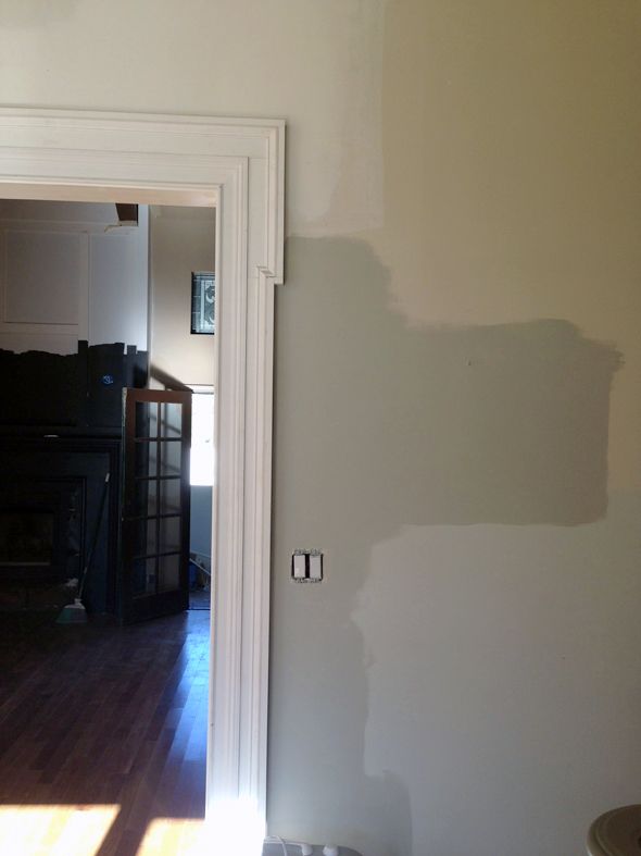
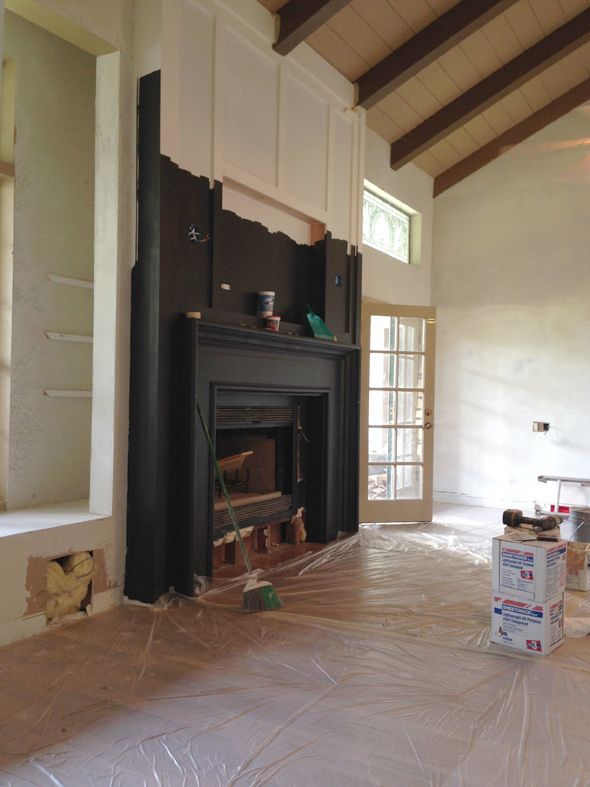
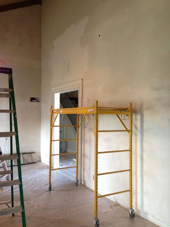
So I took a leap of faith and handed the painters the Brushed Aluminum paint chip. They were actually here for more than a week. I had them float the walls in the living room to cover the high texture on the drywall and that alone took nearly three days. (!!!)
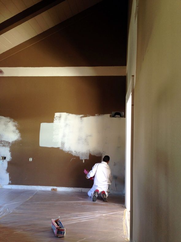
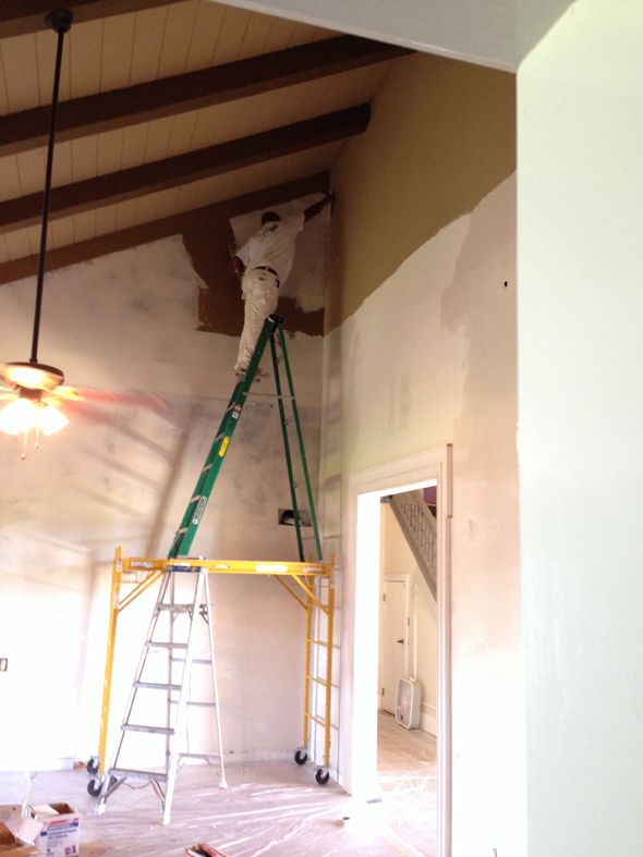
After day two, I was so happy with how much brighter the living room felt with the majority of the brown paint covered up. What a huge difference the light drywall mud was making in the color already! And the smooth texture? SO worth the time and expense. The room has such a glow about it now. The light bounces around in such a lovely way. The other common spaces in the house had already been smooth-coated so it seemed worth it to match the texture in here too, especially since this is a room we'll likely spend the most time in.
I had all the ceilings in the three rooms painted the same white as all the trimwork - Benjamin Moore's Chantilly Lace. It's one of my favorite whites to use because it reads as a true white. There are no gray undertones like White Dove has and no blue undertones like a pure white usually gives off. Simply White is another favorite, but it's a little more yellow than Chantilly Lace. I wanted a bright, clean white in here.
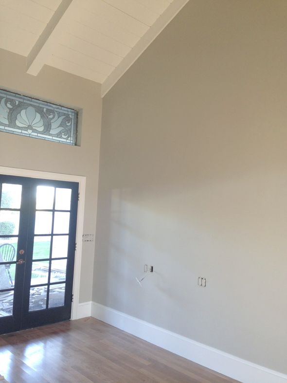
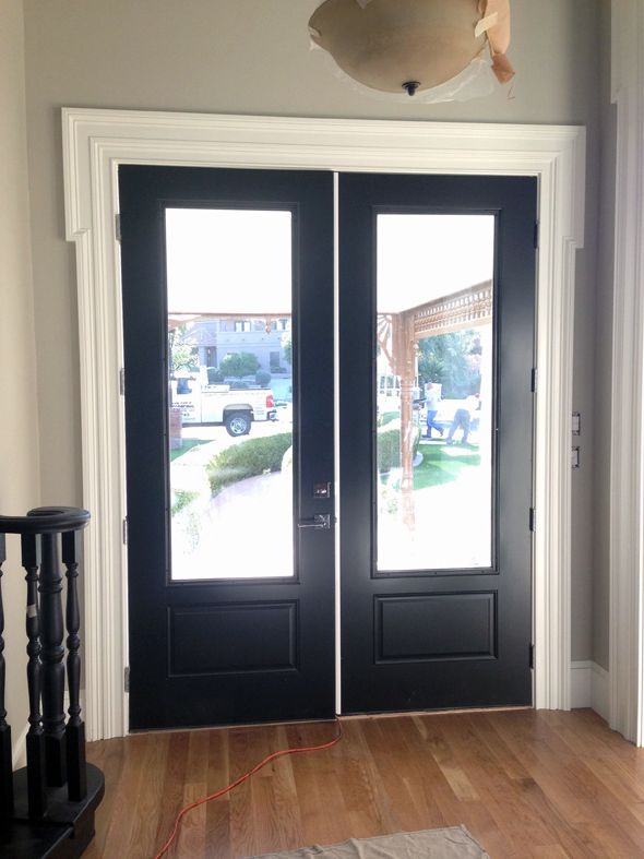
All the doors were painted Onyx, another favorite shade of mine. It's a black with depth - a lot like Farrow and Ball's Off Black (but without the insane price tag!) :) I'm so happy with how the front door turned out! (ps the white astragal down the middle will be black)
We're going to do something special in the music room like lacquer or grasscloth, but I want to go more colorful in there. Michael's vote is a bright, inky blue, which I love.
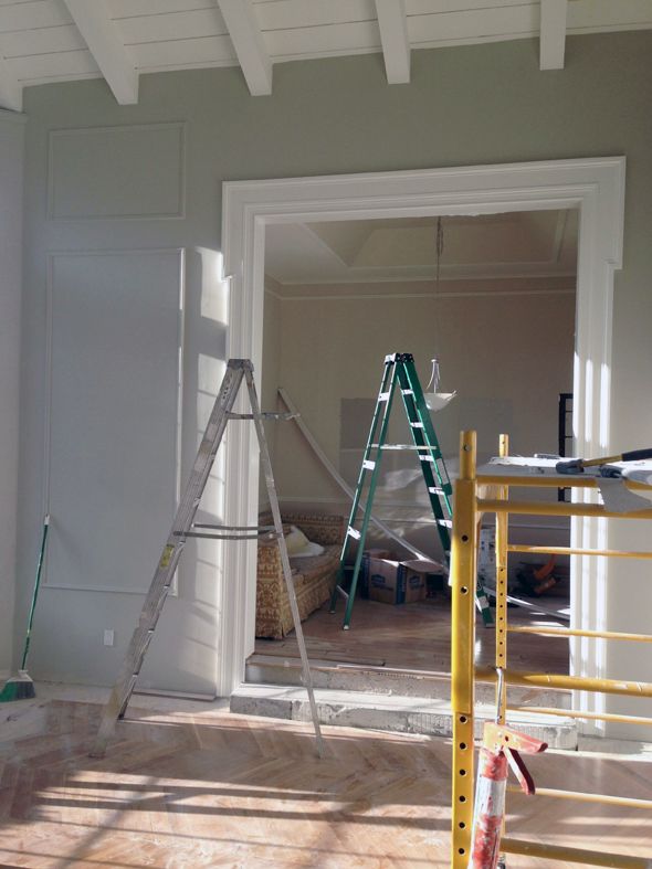
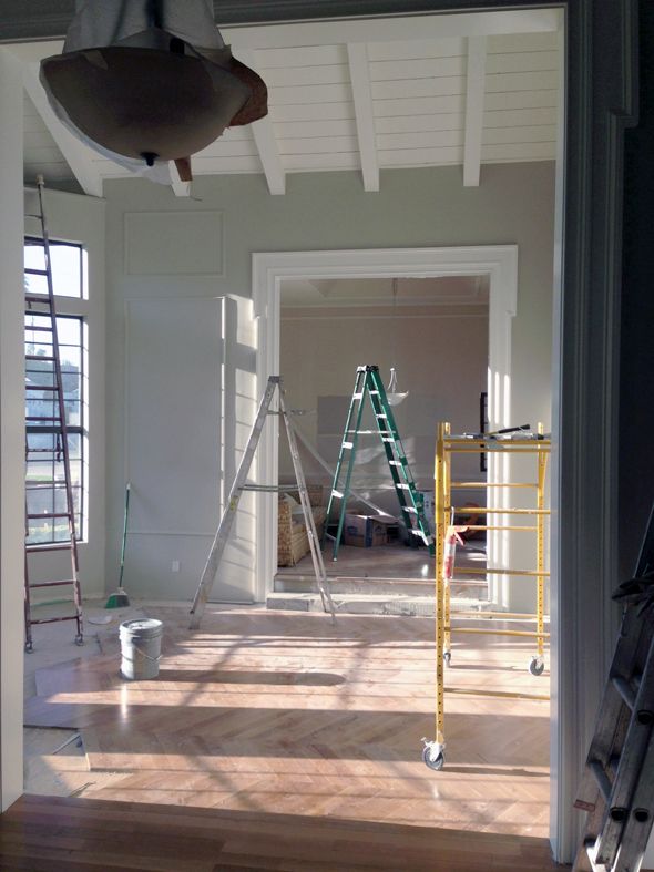
I'm so happy with how the new paint has completely transformed the look and feel of these three spaces! When I look at all those ladders and the scaffolding, I know it was worth every single penny!!
0 comments:
Post a Comment