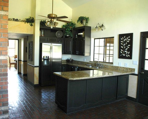
Kitchen Tour (right after we closed on the house)
Open Shelving Inspiration (before I decided on the single shelf look)
The Rough Initial Plans (only about 50% of this ended up happening!)
After painting out the floors and the brick range surround
A big recap of thoughts and plans and details on the Shaker-style cabinet DIY
Black concrete counters DIY and single shelf inspiration
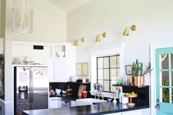
I finally decided though that we would just work with the existing layout and cabinets and use my favorite concrete overlay technique to make this kitchen work for us until we can do a big upgrade.
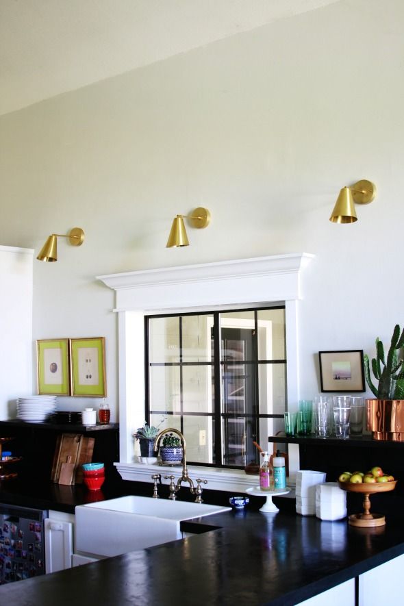
I'm still hoping for a full kitchen reno sometime down the road, but at least for now, the space feels clean and bright! DIY wins again! :) Here's a little more on what we ended up doing and where I bought everything...
One of the splurges of the reno was this farmhouse sink from Signature Hardware. We had some sort of funny dimensions to work with and this one was the least expensive of the options that would fit right. I love the clean lines! I also bought the faucet from Signature Hardware and had a local plating company (Papago Plating) strip off the lacquer finish. I love it.
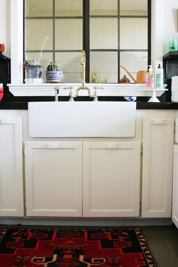
The black concrete counters are holding up really well and I love the dramatic look. The waterfall edge is so pretty, and I think with the creamy white cabinet color and the lighter gray on the floors (Ben Moore's Galveston Gray), the black is not too dark for the space.
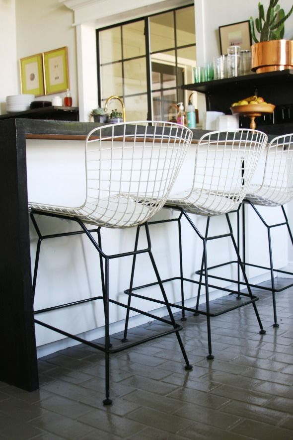
My favorite part though is the little shelf we built with pine boards that I covered in concrete too. I hung them with simple black gloss brackets from Home Deport with brass screws. I wanted the brackets to just sort of go away, which they do! The shelves are super sturdy though too. We have all sorts of heavy things on top (tons of plates on one side and a 20-lb cactus planter on the other!) and it's sturdy as can be.
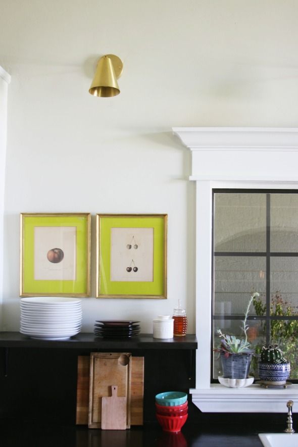
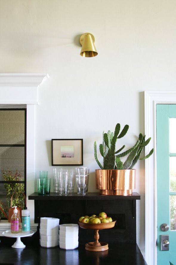
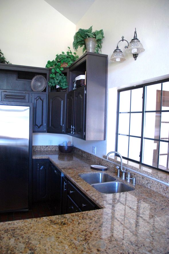
We made a few changes to the lighting too. Just getting those super frilly and outdated pieces out was a huge improvement!
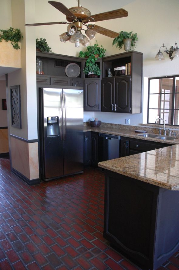
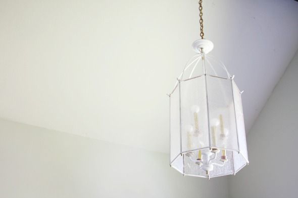
We took down the too-low ceiling fan and the chandelier over the table area and replaced them with two of these lanterns I picked up for a song in New Jersey before we moved. I painted the pink parts white and sprayed the sleeves gold.
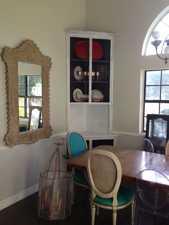
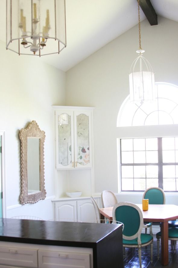
I think a little white paint and round bulbs can make any fixture prettier! :)
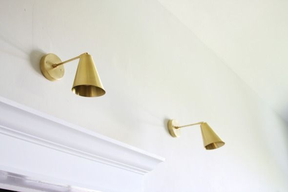
I got three of these brass tilt cone sconces from Cedar and Moss. They are beautiful. I really love them and think they are a steal for the price!!
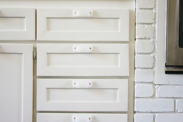
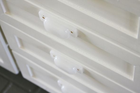
One of my favorite little details of the space ended up being the cabinet hardware! I really wanted something a little different. I searched high and low and finally, finally stumbled on these white milk glass bin pulls. They are so perfect. They just sort of glow! We used brass screws to install them to the drawer fronts, so brass accent is there, but it's subtle.

It's (clearly) not perfect. We did this project fast and furious, but the improvement to me is huge. We are loving it and are so happy we could make the room work for us for as long as it takes to save up for the kitchen of our dreams. :)
0 comments:
Post a Comment