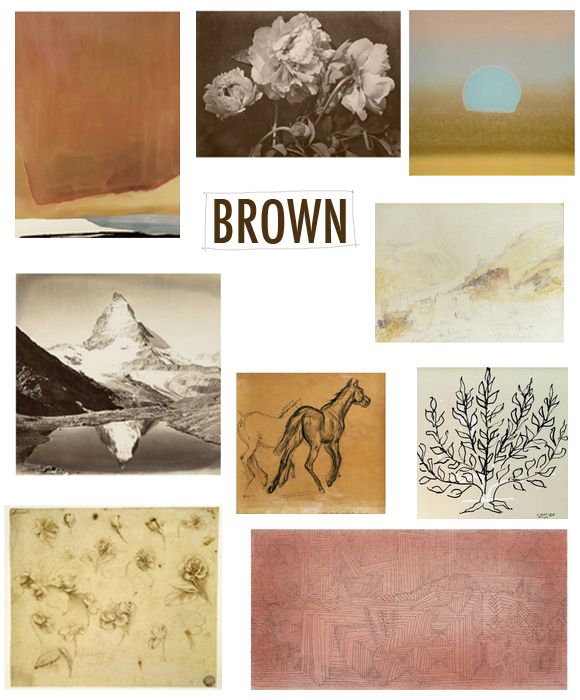
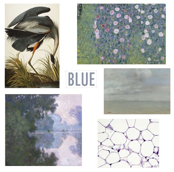
Art.com asked me and a handful of other design bloggers to share some of my favorites for a gift guide. I broke down some of my choices here by the color of the undertones. You know how I'm always going on about color temperature balance? Well for me that goes for art as well, especially more neutral art.
I always like to find color temperature balance in a room. If your walls are a cool gray, with blue undertones, try adding a piece of art with warmer, more brown or yellow undertones.
Or, if you're renting and your walls are builder's beige, try something with a bit more blue in it.
And true black works with all temperatures and should be mixed in, in healthy doses!
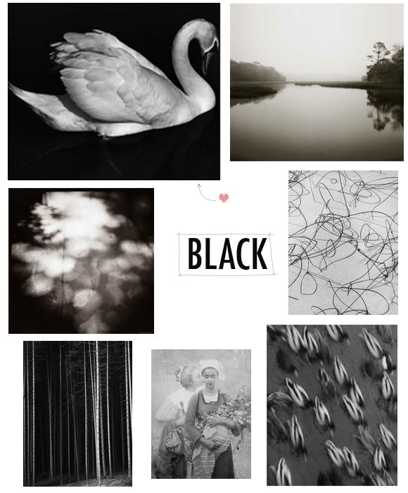
PS I'm trying to not buy that swan print, but there's a 15% off deal on art.com right now, so I don't think my resolve will last long.
PPS How are you guys? Sorry for not posting yesterday - we are nursing some serious colds around here. bleck.
0 comments:
Post a Comment